
Trinity School crest
Trinity School · Brand Guide
Get feedback
Chapter 6 of 6Recipes
Next: Get feedback →
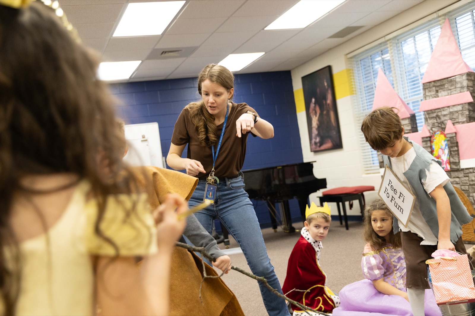
A classroom mid-play, costumes and all
Chapter 6 · Recipes

Make Something Today

Follow a recipe end to end and you don't need approval. That's the point of this guide.

For teachers

The Class Newsletter

  1. Header: navy band, class name in Trajan Pro caps (Cinzel in Google tools), thin gold rule beneath.
  2. Body: Times New Roman 11–12 pt, short paragraphs.
  3. One gold accent: boxed heading, thin rule, or cream date panel. Pick one.
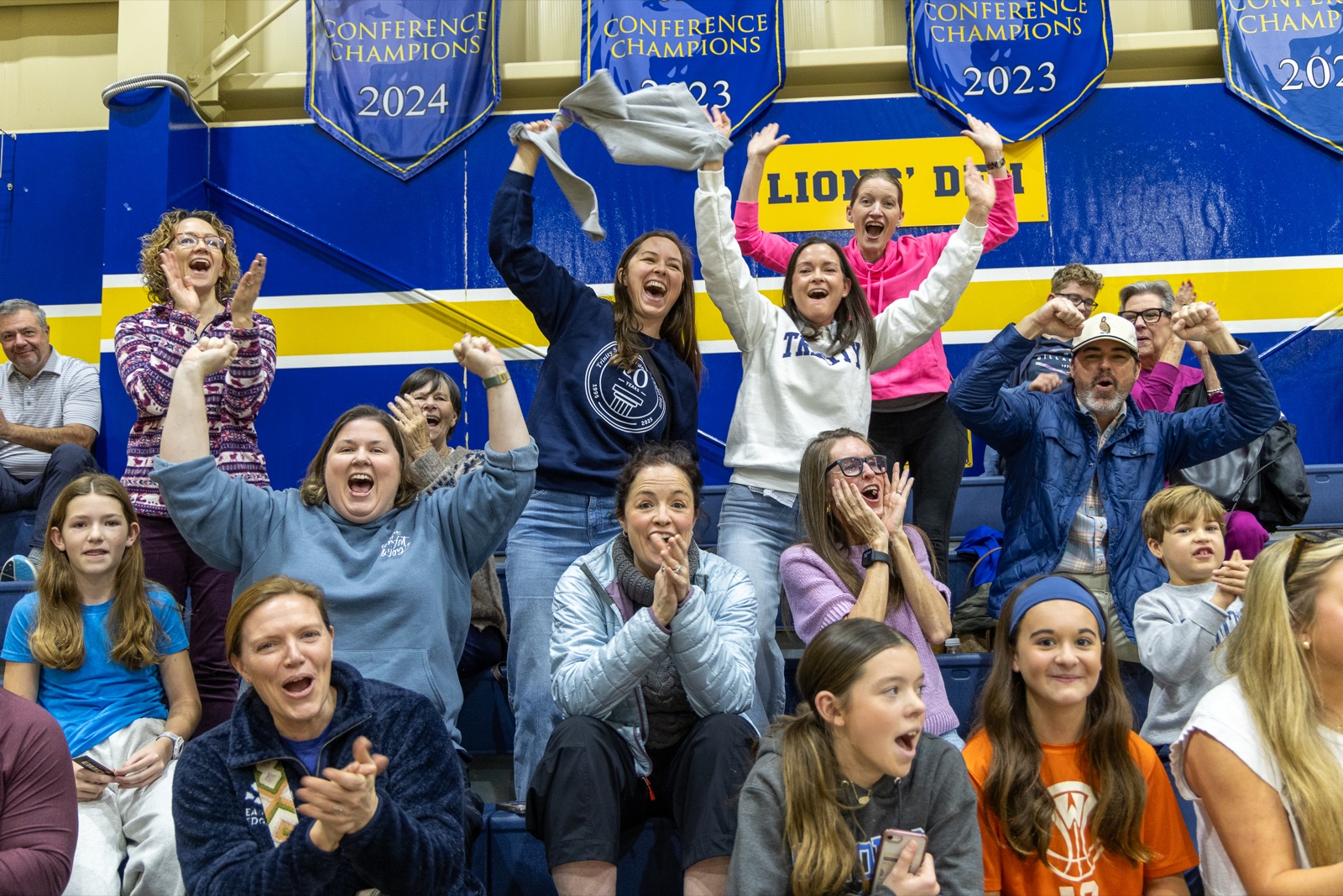
  4. One great photo: a real classroom candid. No clip art, borders, or emoji strings.
  5. Words: open with the why ("This week we savored…"), dates plainly, close warm.
// Third Grade · October 13
Mrs. Miller's Class
This week we savored… our first Colonial Trade unit study, and the baby chicks arrived in Room 6.

Coming up: Field trip forms are due Friday, October 17.

Warmly,
Mrs. Miller
One font pair, one accent, one photoRainbow section colors, clip-art borders, Comic Sans
For coaches & clubs

The T-Shirt & Spiritwear

  1. Garment: navy, gold, white, or athletic gray. (Pink-out, tie-dye? Quick yes first.)
  2. Mark: the Lion, not the crest. White artwork on navy/gray; navy on gold/white. Never redraw a mark.
  3. Text: block caps in Trajan Pro, varsity block, or Arial Bold. "TRINITY" or "TRINITY LIONS."
  4. Personalization: last name and number on the back, same block caps.
  5. Printing: one-color is on-brand and cheaper. Give the vendor PMS 281 + PMS 1225 C. If they only offer stock color names, pick "Navy Blue" — never "Royal Blue."
Navy + white Lion
Gold + navy art
White + navy Lion
Gray + white Lion

Selling the shirts (fundraisers, merch tables)? That always needs written approval first.

Official mark, block caps, vendor gets PMS codesCrest on fan gear, redrawn lions, neon shirts, outlines & effects
For parents & event hosts

The Flyer or Poster

  1. Pick one hero: a great candid photo or a solid navy field with one Trajan-style headline. Not both, not several.
  2. Title: Trajan Pro capitals (Cinzel in Google tools), navy (or white on navy). The little words go italic: "A Night of Lessons and Carols."
  3. Details in a cream band: date, time, place in Times, stated plainly, no countdown clocks, no "don't miss out!"
  4. One gold device: a keyline box around the title or a thin rule. A QR code is fine: navy on white, small, in a corner.
  5. Finish: the crest, small and centered at the bottom, or the Lion if it's a spirit event.

The poster-page trick from our print work: when in doubt, a solid navy page, one gold sentence in the middle, crest at the bottom. It is almost impossible to get wrong and it always looks like Trinity.

One hero, cream details band, crest small at bottomWord-art, starbursts, urgency copy, five fonts
For staff & presenters

Slides & Documents

  1. Title slide: solid navy, white crest small at top, title in Trajan Pro capitals (Cinzel in Google Slides), italic Times subtitle.
  2. Body slides: white, navy headings, Times or Arial body, one idea per slide. Unhurried applies to decks too.
  3. Accents: thin gold rules under headings; gold for one big number, never for body text.
  4. Documents: Times New Roman 11–12 pt, navy headings, crest on page one only. Letterhead exists; ask before recreating it.

Charts: navy bars, one gold highlight bar for the number that matters, Arial labels. No 3-D, no rainbow series.

Navy title slide, white body, gold for the one big numberTemplate themes, gradients, bullet walls

Before You Hit Print

  1. Is navy doing the talking, with gold as garnish? (Feel I)
  2. One classical title face, one calm body face, nothing louder? (Feel II)
  3. Could this page breathe more? Remove one thing. (Feel III)
  4. Is every photo a real Trinity moment? (Feel IV)
  5. Are the marks untouched: right colorway, right background, clear space? (Logos)
  6. Would the words sound right read aloud in chapel? (Feel VI)
← WordsGet Feedback →
Get feedback on a draft