
Trinity School crest
Trinity School of Durham and Chapel Hill

Brand Guide

How to make it look — and sound — like Trinity.
Start here

Welcome

Everything you need, before you need to ask.

What is this?

A short, practical guide to Trinity's visual and written identity — the colors, type, logos, photos, and words that make something feel like Trinity, and simple recipes for using them.

Who is it for?

Everyone who makes things: teachers writing class newsletters, coaches ordering spiritwear, parents making event flyers, staff building slides. No design experience needed.

What if something doesn't match?

Nothing bad happens to you — but off-brand items may be asked to retire, regardless of cost. When in doubt, ask first. It's a two-minute email.

The feel

What Makes It Trinity

Six habits behind everything that feels right. When your piece drifts, it has usually broken one of these.
I

Navy is the voice. Gold is the garnish.

Navy does the talking — text, backgrounds, authority. Gold appears in small, deliberate doses: a thin rule, a keyline box, one big number. The exception: an all-navy or all-gold "poster" moment carrying a single sentence.

In practice: if gold covers more than ~10% of your piece and it isn't a poster or a shirt, dial it back.
II

Classical type, gracious case.

Titles wear Trajan-style capitals with room to breathe. Sentences wear Times New Roman. Pull quotes go bold italic. In headlines, the little words — of, in, and, the — are set in italic.

In practice: one classical title, calm serif body, nothing shouting.
III

Unhurried whitespace.

We are literally the "rich yet unhurried" school — our pages should look like it. One idea per page. Generous margins. A warm cream band is how a page takes a breath.

In practice: when a layout feels crowded, remove an element instead of shrinking everything.
IV

Real moments, warm light.

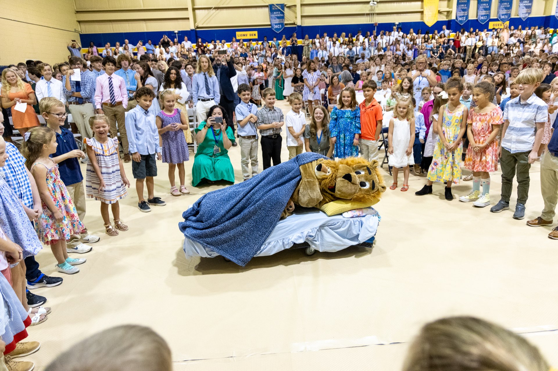
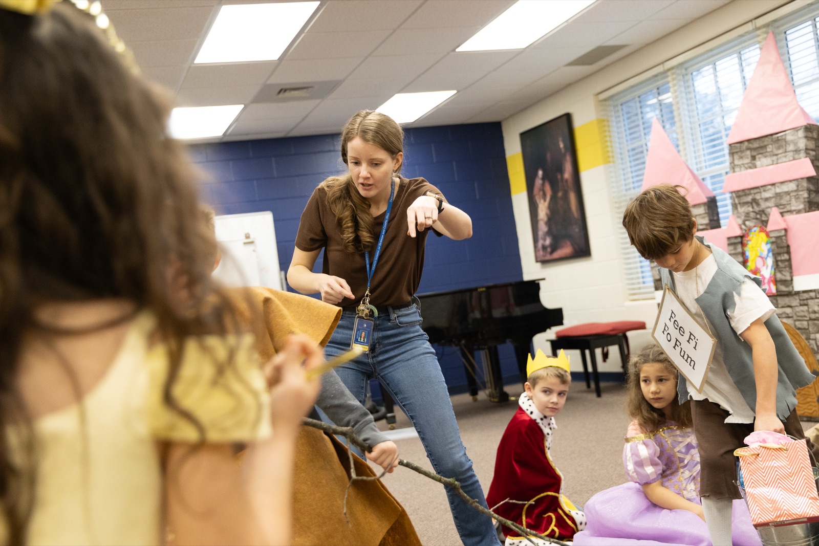
Photography is candid and mid-action: real laughter, paint on hands, the cap toss. Natural daylight, warm and unfiltered. Our navy-and-gold world shows up in the frame on its own.

In practice: one great candid photo beats four posed ones — and any clip art.
V

Geometry from the crest: the quarter circle.

Our shapes come from the crest's trinity-knot curves. Photos get quarter-circle corners, collages stack quarter and half circles, corners carry a navy-and-gold quarter-circle mark, and gold dots fill quiet cells.

In practice: round one corner fully, not all four a little. No other decorative shapes.
VI

Words that bless, never sell.

Warm, plain, and confident. Numbers are stated as testament, not pitch. Growth is credited to God's faithfulness and the community's generosity — never to our own excellence. No hype, no urgency, no "kids."

In practice: open with the why, state facts plainly, close with a warm invitation.
Colors

The Palette

Two colors, one cream, and plenty of white. Click any code to copy it.
Trinity BluePMS 654 · RGB 32 52 98
CMYK 99 / 87 / 34 / 24
Trinity GoldPMS 1225 C · RGB 246 198 79
CMYK 3 / 22 / 80 / 0
Warm CreamBreather bands & quote panels.
Warm, never gray, never cool.
WhiteThe default canvas — most of every page, most of the time.
WHITE ~75% NAVY ~20% GOLD
The everyday recipe: white leads, navy speaks, gold garnishes. Poster moments (a solid navy or gold page with one sentence on it) are the earned exception — use at most one per piece.

If / then

  • Text on white → navy, never gold.
  • Background is navy → text is white, accents gold.
  • Background is gold → text is navy only.
  • Need a soft panel → cream (#FBF7EC), not gray.
  • Want a third color → cream is the third color; photos supply the rest. (The magazine's pastel confetti accents are a designer-only kit — decoration, never text, never everyday pieces.)

Print, fabric & screens

  • Web & slides: use the hex codes. Print: use CMYK. Embroidery/screenprint: give the vendor PMS 654 + PMS 1225 C.
  • Fabric never matches perfectly — pick the closest stock navy and gold and stay close; never drift to black, royal blue, or orange-gold.
  • Some Trinity websites use a lighter navy (#1F3C6E). For anything new, use #203462.
Typography

Type

Three jobs, three faces — with honest substitutes for the rest of us.
Titles & headings
Lower School

Trajan Pro — always capitals, letter-spaced, never bold-shouted. Titles, section heads, formal signage.

Don't have it? Use Cinzel (free in Canva & Google Fonts) or Times New Roman in ALL CAPS with wide letter spacing.
Body & headlines
Education is a lifelong process, and we want to challenge our students.

Times New Roman — body copy, sub-heads, pull quotes (bold italic). The workhorse; it is already on every machine.

Substitute: Cambria. In Canva: Times New Roman or PT Serif.
Labels & practical text
// Financial Report

Myriad Pro — small labels, captions, charts, utilitarian signage. Eyebrow labels get a gold "//" prefix. On badges and name tags: Trajan speaks for the institution, bold sans capitals for the person.

Substitute: Arial. (Gotham appears on Trinity websites; treat it as web-only.) Avoid condensed ALL-CAPS sans headlines — that's the old, retired look.
Boxed Headings

Section headings sit inside a thin gold keyline box — navy Trajan capitals, generous padding, like the one above. It is the most recognizable device in Trinity print. Use it once or twice per piece, never for every heading.

Highlights of TK Life
— headline case: the little words (of, in, and, the) go italic.
"Trinity wasn't just an option; it was a calling for our family."
— Trinity parent
— pull quotes: Times bold italic, navy, with a thin gold rule.
Logos

The Marks

Three marks, three levels of formality. Pick by occasion, not by preference.
Trinity crest
Formal · Academic

The Crest

Our most formal mark — used with reverence, small and centered, never decorated. Comes in full color, all-navy, all-gold, and all-white.

Belongs on: letterhead, certificates, event programs, formal invitations, official communications, the podium.
Trinity Lion
Athletics · Spirit

The Lion

Our athletic identity — and the right choice anywhere the crest would feel too formal. On dark backgrounds, use the white version; never invert the artwork yourself.

Belongs on: uniforms, spiritwear, gym signage, team graphics, fan gear, camp shirts.
Trinity T
Athletics · Casual

The Trinity T

The varsity letter — navy block T with a gold keyline. The simplest mark we have, and the friendliest to one-color printing and small embroidery.

Belongs on: caps, sleeves, chest crests on spiritwear, water bottles, small-format merch.
Which Version, On Which Background?
On white or cream → full-color or all-navy marks
On navy or photos → gold or white marks
On gold → navy marks only
Minimum sizes: crest — 0.5″ / 48 px tall; Lion — 0.5″ / 48 px; Trinity T — 0.25″ / 24 px. Clear space: keep at least the width of the T's stem empty on every side of any mark. Smaller than that, or on a busy area? Use a simpler mark, or move it.
Never Do This
Don't stretch, squish, or rotate any mark.
Don't recolor a mark — the approved colorways are the palette.
Don't add shadows, glows, outlines, or effects.
Don't place marks over busy photo areas.
Don't trap a mark in a white box — use the right colorway instead.
Don't flip the Lion's colors for dark backgrounds — use the real white version.

And one big one: don't create new logos, lockups, or mascot drawings — for a team, a club, a class, or an event. If something needs its own mark, ask and we'll make one with you. Trinity's marks are for official school use and may not be put on items for sale without written consent.

Photography

Photos

Candid, warm, mid-action — the joy is real, so the camera just has to be there.
Middle School Turkey Bowl
Opening chapel
Easter chapel
Campus from above
The collage rule in action: photos and color blocks share one grid; quarter-circle corners come from the crest's curves; empty cells are solid navy, solid gold, or gold dots on cream. Round one corner fully — not every corner a little.

Do

  • Catch students mid-action: building, painting, running, singing, laughing for real.
  • Shoot in natural, warm light — outdoors and bright interiors.
  • Let campus, uniforms, and banners bring navy and gold into the frame naturally.
  • Crop tight on faces and hands for collages; go full-bleed for the big emotional moment.
  • Posed portraits are fine where portraits belong: staff headshots, senior circles.

Don't

  • No stock photography, ever. An imperfect real photo beats a perfect fake one.
  • No heavy filters, cool color grades, or black-and-white for everyday use.
  • No stretched or squished photos — crop instead.
  • No text over faces, and no gradient scrims — if you need type on a photo, use a solid navy or gold block.
  • Gold duotone photo covers are a designer move — ask before DIY-ing one.
Voice & words

Words

Sound like a letter from someone who knows your child — never like a brochure.
Warm, but never salesy.
Confident, but never boastful — numbers are testament, not pitch.
Faithful, but always hospitable — "arms wide open."
Unhurried, but never vague — state dates and facts plainly.
Playful, but rationed — camps and Lions cheer; academic and faith pages don't.
Grateful, but never self-congratulating — credit God's faithfulness and the community.

Phrases we live by

"…teaching the classical tools of learning; providing a rich yet unhurried education; and communicating truth, goodness, and beauty."

Known & Loved · Classical, Rich & Unhurried · "A community with purpose"

"Once a Lion, always a Lion!" · TK Cubs · #Lions4Life

Non nobis, Domine.Not to us, O Lord. The school motto, and the reason our writing credits God and community, not ourselves.

We sayNot
students, children, learnerskids
Head of Schoolheadmaster, principal
flexible tuitionfinancial aid, scholarships
Enrollment Management officeAdmissions office
invest / investors (in giving contexts)donate / donors
Lower School, Middle School, Upper Schoolelementary, junior high
transitional kindergarten (TK)pre-K
fourth graders, kindergartners4th graders
Grandparents DayGrandparent's / Grandparents' Day
Varsity Gold Boys Basketball (level · color · gender · sport)the boys' gold varsity b-ball team
Quick Writing Rules
Recipes

Make Something

Follow a recipe end to end and you don't need approval — that's the point of this guide.
For teachers

The Class Newsletter

  1. Header: navy band, your class name in Cinzel or Times capitals (white), a small gold eyebrow label above it — then a thin gold rule under the band.
  2. Body: Times New Roman (or Cambria), 11–12 pt, black or navy, left-aligned. Short paragraphs — two to four sentences.
  3. One gold accent: a boxed heading, a thin rule between sections, or a cream panel for dates — pick one, not all three.
  4. One great photo: a real candid from your classroom. Skip clip art, borders, and emoji strings.
  5. Sign-off: open with the why ("This week we savored…"), state dates plainly, close warm. Sign your name.
// Third Grade · October 13
Mrs. Miller's Class
This week we savored… our first Colonial Trade unit study, and the baby chicks arrived in Room 6.

Coming up: Field trip forms are due Friday, October 17.

Warmly,
Mrs. Miller
✓ One font pair, one accent, one photo✕ Rainbow section colors, clip-art borders, Comic Sans
For coaches & clubs

The T-Shirt & Spiritwear

  1. Garment color: navy, gold, white, or athletic gray. (Special colors — pink-out, tie-dye — need a quick yes first.)
  2. Mark: the Lion or the Trinity T — not the crest; save it for formal wear. On navy or gray use the white Lion or the T; on gold or white use navy artwork. Never redraw or trace a mark.
  3. Text: block capitals — Cinzel, a varsity block font, or Arial Bold caps. "TRINITY" or "TRINITY LIONS," team name under it if you need it.
  4. Personalization: last name and number on the back are welcome — same block caps.
  5. Printing: one-color prints are on-brand and cheaper — white on navy, navy on gold. Give the vendor PMS 654 and PMS 1225 C.
Navy + white Lion
Gold + navy art
White + the T
Gray + white Lion

Selling the shirts (fundraisers, merch tables)? That always needs written approval first.

✓ Official mark, block caps, vendor gets PMS codes✕ Crest on fan gear, redrawn lions, neon shirts, outlines & effects
For parents & event hosts

The Flyer or Poster

  1. Pick one hero: a great candid photo or a solid navy field with one Trajan-style headline. Not both, not several.
  2. Title: Cinzel or Times capitals, navy (or white on navy). The little words go italic: "A Night of Lessons and Carols."
  3. Details in a cream band: date, time, place in Times — stated plainly, no countdown clocks, no "don't miss out!"
  4. One gold device: a keyline box around the title or a thin rule. A QR code is fine — navy on white, small, in a corner.
  5. Finish: the crest, small and centered at the bottom — or the Lion if it's a spirit event.

The poster-page trick from our print work: when in doubt, a solid navy page, one gold sentence in the middle, crest at the bottom. It is almost impossible to get wrong and it always looks like Trinity.

✓ One hero, cream details band, crest small at bottom✕ Word-art, starbursts, urgency copy, five fonts
For staff & presenters

Slides & Documents

  1. Title slide: solid navy, white crest small at top, title in Cinzel/Times capitals, italic Times subtitle.
  2. Body slides: white, navy headings, Times or Arial body, one idea per slide — unhurried applies to decks too.
  3. Accents: thin gold rules under headings; gold for one big number, never for body text.
  4. Documents: Times New Roman 11–12 pt, navy headings, crest on page one only. Letterhead exists — ask before recreating it.

Charts: navy bars, one gold highlight bar for the number that matters, Arial labels. No 3-D, no rainbow series.

✓ Navy title slide, white body, gold for the one big number✕ Template themes, gradients, bullet walls

Before You Hit Print

  1. Is navy doing the talking, with gold as garnish? (Feel I)
  2. One classical title face, one calm body face — nothing louder? (Feel II)
  3. Could this page breathe more? Remove one thing. (Feel III)
  4. Is every photo a real Trinity moment? (Feel IV)
  5. Are the marks untouched — right colorway, right background, clear space? (Logos)
  6. Would the words sound right read aloud in chapel? (Feel VI)
Downloads

Assets

Everything official, ready to use — never screenshot a logo off a website.

Logos (quick PNGs)

Transparent backgrounds — drop them straight onto your design.

Full sets & vectors

Vendors and print shops usually want the vector files — send them the folder link.

Reference

Canva brand kit & ready-made templates: coming soon.
Questions & approvals

When To Ask

Every rule here ends in a door, not a wall.

Go ahead — no approval needed

  • Anything that follows a recipe on this page, start to finish.
  • Class newsletters, internal flyers, slides, and documents using the palette, type, and marks as shown.
  • Team spiritwear in the approved garment colors with the Lion or the T.

Quick email first

  • Anything for sale — merch, fundraiser items, spirit store.
  • Special garment colors, duotone photo treatments, letterhead.
  • Anything reaching a public audience: press, paid ads, large banners, signage.
  • A new logo, mascot drawing, or lockup — we'll make one with you.
Nathan Clendenin — Communications · nclendenin@tsdch.org
Send a screenshot or an idea — you'll get a fast yes, a quick fix, or help making it better. Most answers take one email.
Copied